College-List Builder UX Optimization
I enhanced the platform’s usability by streamlining the user flow and establishing a scalable design system, to enable students to more easily discover postsecondary pathways that align with their goals.
OneGoal
12 months
Nov 2023
Solo Designer
EdTech web tool

Impact ✅
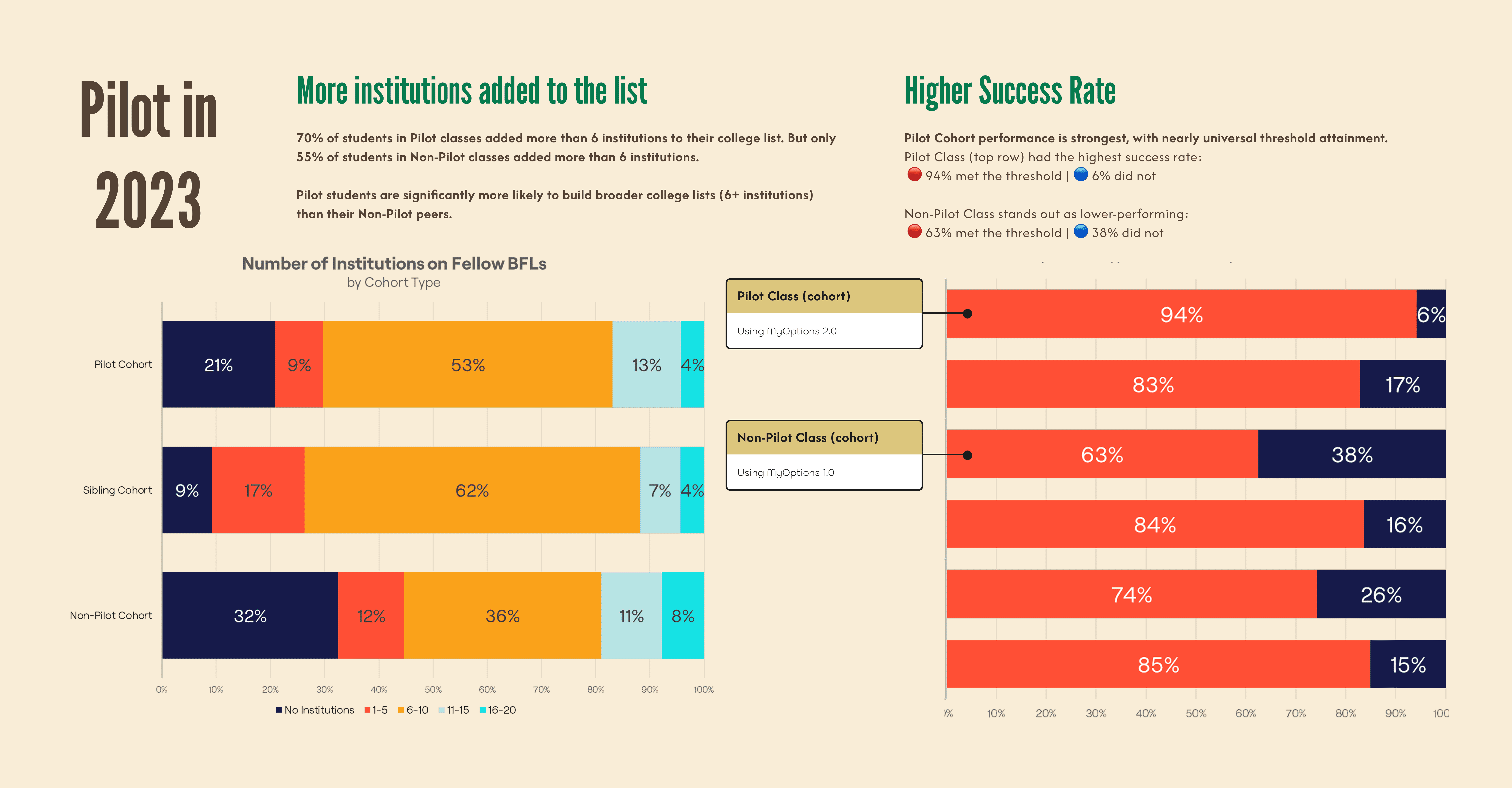
We’ve scaled MyOptions from 327 to 1,480 classes, enabling broader access across programs. To date, students have created and shared over 12,819 college lists with teachers, schools, and OneGoal staff.
We’re now seeing a consistent monthly submission of 1000 lists across all regions, reflecting strong and sustained engagement rate of 98%.
CONTEXT
Intro
MyOptions empowers students to explore postsecondary options aligned with their personal, academic, and financial fit. It supports diverse pathways beyond traditional 2- or 4-year institutions and facilitates meaningful advisor conversations.
Designed to replace clunky spreadsheets, the web tool offers a streamlined, intuitive experience grounded in OneGoal’s Enrollment Framework, which emphasizes completion support and individualized guidance.
Tool History
MyOptions V1.0 began in early 2022 before I joined OneGoal. The regional team led the initial launch in collaboration with a third-party design agency.
While that work was underway, I focused on building OneGoal’s design system—defining our brand identity and establishing core design principles. I transitioned to leading design efforts for MyOptions V2.0 in late 2022.
My Role
My role centered on improving the UI/UX to align with our new design standards and enhance the overall user experience in preparation for a pilot launch in late 2023.
PROBLEMS
The Pilot data of MyOptions v1.0 presented a unique set of UX hurdles:
Inconsistent Brand Experience
MyOptions V1.0 lacked visual and functional alignment with OneGoal’s evolving design system.
Unclear Language & Terminology
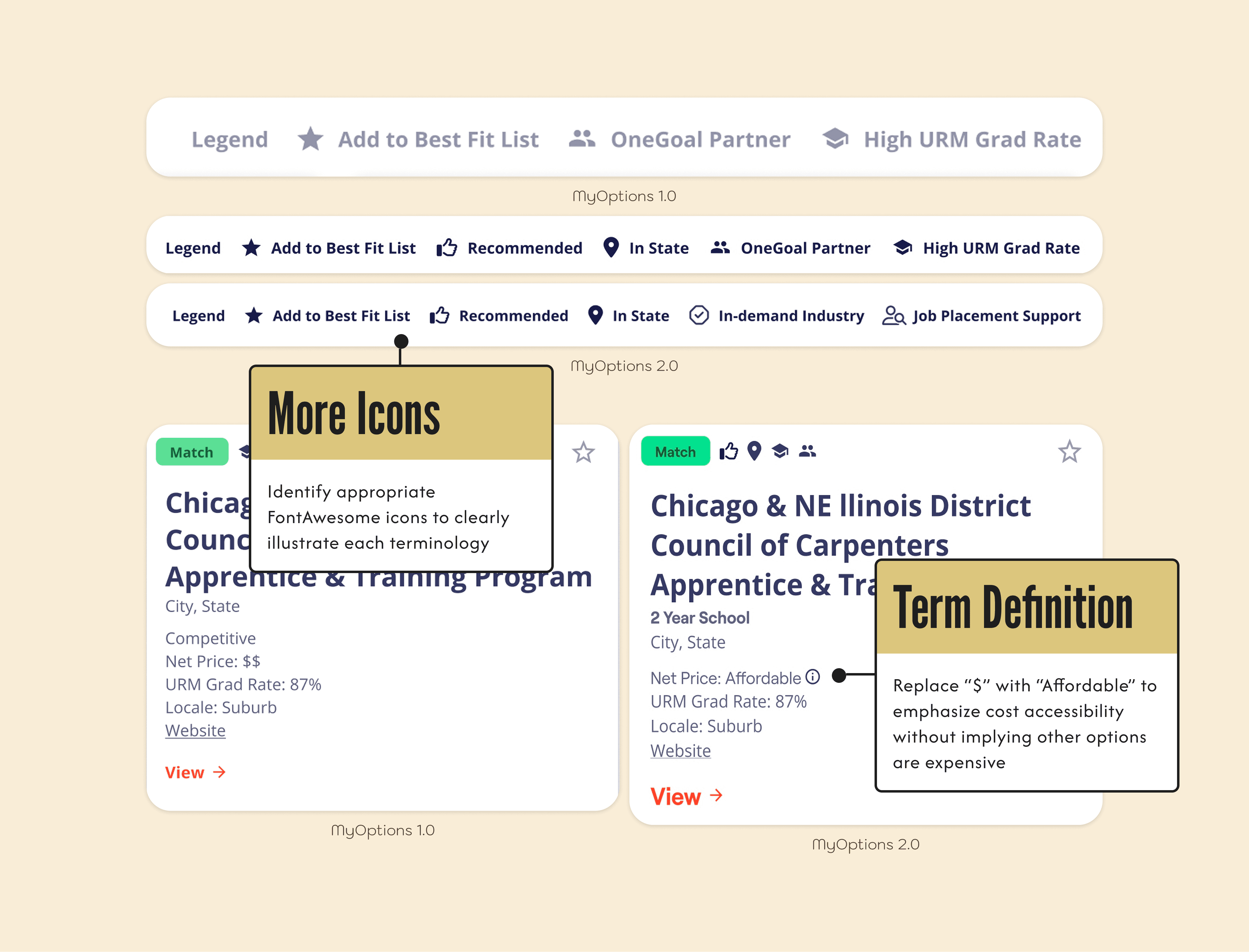
Students struggled to understand key terms without visual support or contextual guidance.
Confusing User Flow
The journey to explore and evaluate postsecondary options was unintuitive and hard to navigate.
Limited Features for Exploration
The tool didn’t support flexible search, filter, or comparison features—limiting students’ ability to explore multiple pathways effectively.
Problem Statement ✏️
Students need a clear, intuitive, and accessible way to explore their postsecondary options—grounded in OneGoal’s brand and supported by a consistent, user-centered digital experience.
DESIGN
Based on learnings I collected from both class visits and moderated usability tests.
Design System
Aligning the interface with OneGoal’s brand and design guidelines, ensuring visual and functional consistency.

Definition & Representation
New accessible, intuitive icons to clarify OneGoal-specific terminology.
User Flow Enhancement
Refining the user flow to reduce friction and support decision-making.
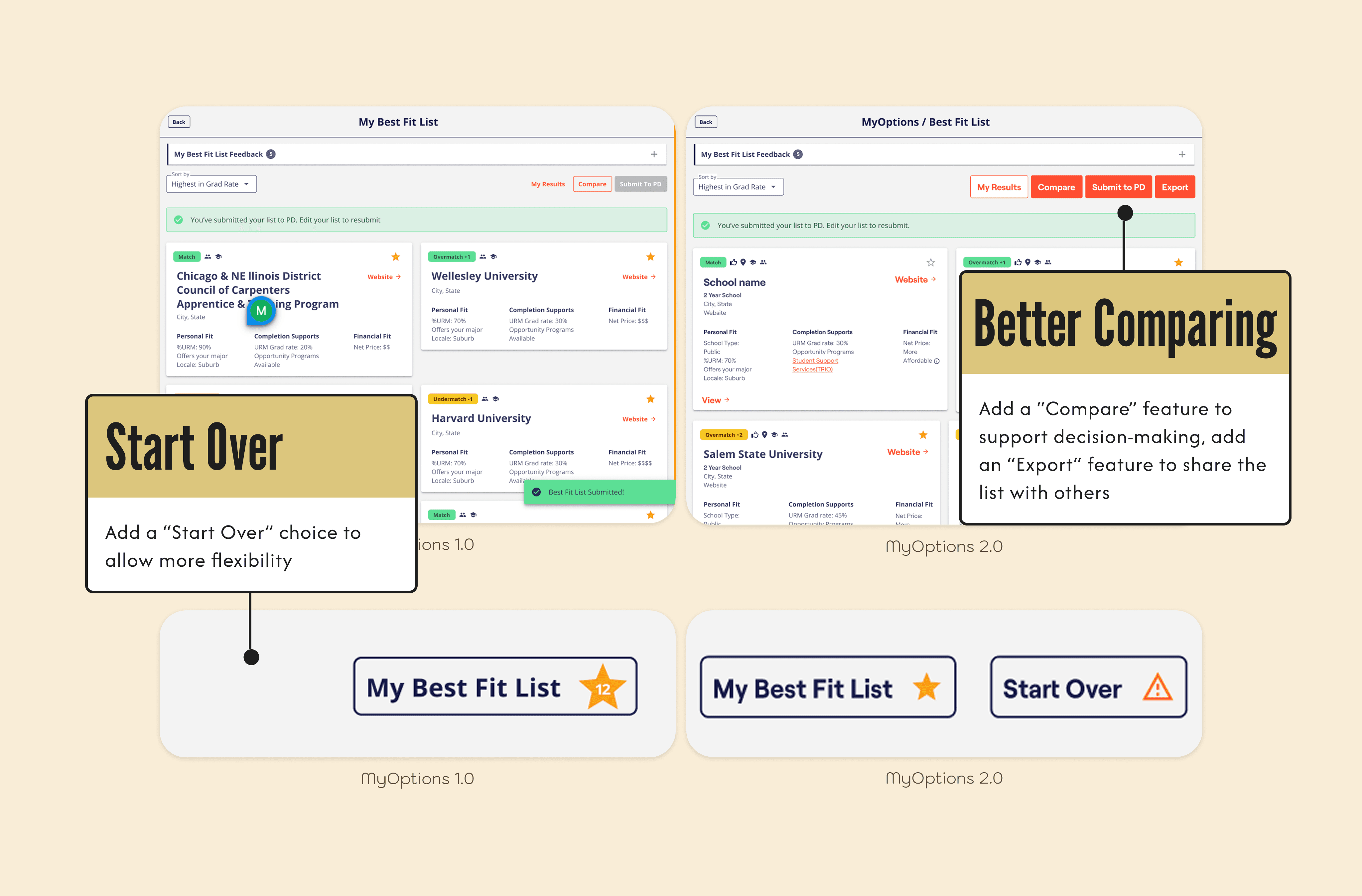
New Features
Implementing adaptable search and filter functions to help students easily explore multiple postsecondary pathways based on their unique needs and interests.

OUTCOME 📈
NEXT STEPS
Learning is communicated in real-time.
We continued to learn from insights of the MyOptions tool implementation.
Granularity & Regional Relevance
Expand the database to include more schools, institutions, and pathways
Tailor the tool to meet the unique needs of different schools, regions and even states
Flexibility & Future Readiness
Evolve the design for adaptability across multiple products and program models
Integrate new technologies and trends without reinventing the experience, such as AI supports
Broaden the definition of postsecondary success to reflect diverse student journeys